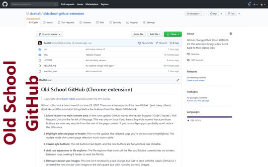
Old School GitHub 作者: Dean Attali
Revert GitHub's UI back to its classic look (before the June 23, 2020 update that has a flat, rounded and more whitespaced design).
71 位使用者71 位使用者
擴充套件後設資料
畫面擷圖
關於此擴充套件
Code available on GitHub
Features
=========
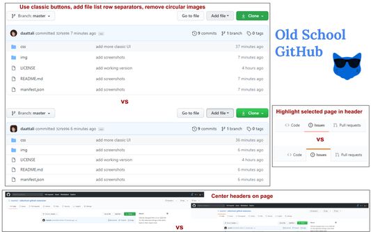
1. Move header tabs to main content area: In the June update, GitHub moved the header buttons ("Code"/"Issues"/"Pull Requests"/etc) to the far left of the page. This became an issue if you have a big wide monitor because those buttons are now very very far from the rest of the page content. If you're on a laptop you probably won't notice the difference.
2. Highlight selected page in header: Prior to the update, the selected page you're on was clearly highlighted. The update made the current page selection much more subtle.
3. Classic-syle buttons and labels: The old buttons had depth and bold font, and the new buttons are flat and look less clickable.
4. Add row separators in file explorer: The file explorer that shows all the files and folders currently has no borders between rows, making it harder to read the file list.
5. Remove circular user images and rounded corners everywhere: The new circular user photos result in unwanted rounding near the corners, cropping significant features from photos that are intended to be square for some users. Many other items were also made very round.
And many other UI fixes such as fix the text width of issue counters and issue label, fix the whitespace of issues, add a slight background to README title, and more.
Limitations
=========
This extension can change the look of existing items on the page, but it cannot change the layout of the page by moving things around.
For example, a common question is whether the repository sidebar can be moved to be above the main code section, like it was previously. Unfortunately that is not possible (or extremely difficult).
The reason is because of the strange way GitHub handles internal links: some pages are actual page reloads, but some pages are fully loaded with AJAX. This makes it impossible to use JavaScript to fix any UI issues, and only CSS can be used. If you're on the Code tab and you click on Pull Requests then you don't actually refresh the page, but if you click on Issues then it is a new page. What that means is that after moving from Code to Pull Requests, any JavaScript changes are reverted because large portions of the page body were re-written. Technically it's possible to find hacky ways around that, using event listeners or mutator observers or any other technique and try to force a re-initialization of the JavaScript when a new page is AJAX-loaded, but that would be extremely difficult to work correctly and would be non performant. So unfortunately only CSS is used.
Features
=========
1. Move header tabs to main content area: In the June update, GitHub moved the header buttons ("Code"/"Issues"/"Pull Requests"/etc) to the far left of the page. This became an issue if you have a big wide monitor because those buttons are now very very far from the rest of the page content. If you're on a laptop you probably won't notice the difference.
2. Highlight selected page in header: Prior to the update, the selected page you're on was clearly highlighted. The update made the current page selection much more subtle.
3. Classic-syle buttons and labels: The old buttons had depth and bold font, and the new buttons are flat and look less clickable.
4. Add row separators in file explorer: The file explorer that shows all the files and folders currently has no borders between rows, making it harder to read the file list.
5. Remove circular user images and rounded corners everywhere: The new circular user photos result in unwanted rounding near the corners, cropping significant features from photos that are intended to be square for some users. Many other items were also made very round.
And many other UI fixes such as fix the text width of issue counters and issue label, fix the whitespace of issues, add a slight background to README title, and more.
Limitations
=========
This extension can change the look of existing items on the page, but it cannot change the layout of the page by moving things around.
For example, a common question is whether the repository sidebar can be moved to be above the main code section, like it was previously. Unfortunately that is not possible (or extremely difficult).
The reason is because of the strange way GitHub handles internal links: some pages are actual page reloads, but some pages are fully loaded with AJAX. This makes it impossible to use JavaScript to fix any UI issues, and only CSS can be used. If you're on the Code tab and you click on Pull Requests then you don't actually refresh the page, but if you click on Issues then it is a new page. What that means is that after moving from Code to Pull Requests, any JavaScript changes are reverted because large portions of the page body were re-written. Technically it's possible to find hacky ways around that, using event listeners or mutator observers or any other technique and try to force a re-initialization of the JavaScript when a new page is AJAX-loaded, but that would be extremely difficult to work correctly and would be non performant. So unfortunately only CSS is used.
由 1 位評論者給出 4.7 分
權限與資料
更多資訊
- 附加元件網址
- 版本
- 1.9.0
- 大小
- 22.73 KB
- 最近更新
- 2 年前 (2024年6月14日)
- 授權條款
- MIT License
- 版本紀錄
- 新增至收藏集